Have you seen the "Series 2004 $20 Notes"? The U.S. Treasury has rolled out yet another revamp of the U.S. twenty dollar bill in an effort to stop those pesky counterfeiters once and for all. It features high-tech fake-busting elements like a watermark, a security thread, and color-shifting ink. It also features crappy design.
I'm not going to concern myself here with a critique of the front of the bill (my friend Jeff says "it looks like something got spilled on it."). It's the back of the note that's driving me crazy.
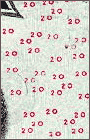
In particular, it's all those little 20s haphazardly sprinkled in the white space. They are nails-on-a-chalkboard to my visual design senses.
Are they supposed to be another security feature? ("They'll NEVER be able to duplicate this $20... look at those 20s... they're all OVER the place!") Did they let a summer intern at the Bureau of Engraving and Printing design it? ("Hey, let Jimmy try it!") Were they concerned the $20 bill might be confused with a $10? ("What this 20 needs is a LOT more 20s.")
There must be more to it. My theory: the new 20s contain subliminal connect-the-dots messages, like tiny constellations. So, perhaps the 20s connect to form a secret message designed to stimulate the economy ("SPEND MORE") or boost patriotism ("WE'RE NO.1").
I'm not sure I've successfully cracked the code, so I'm asking for your help. I encourage you all to get a new $20 bill, connect the dots to find the message on the back (pencil is best), and mail it to me for review. Together, we can get to the bottom of this.